ExhibitInterview with Karine Savard: on a colour
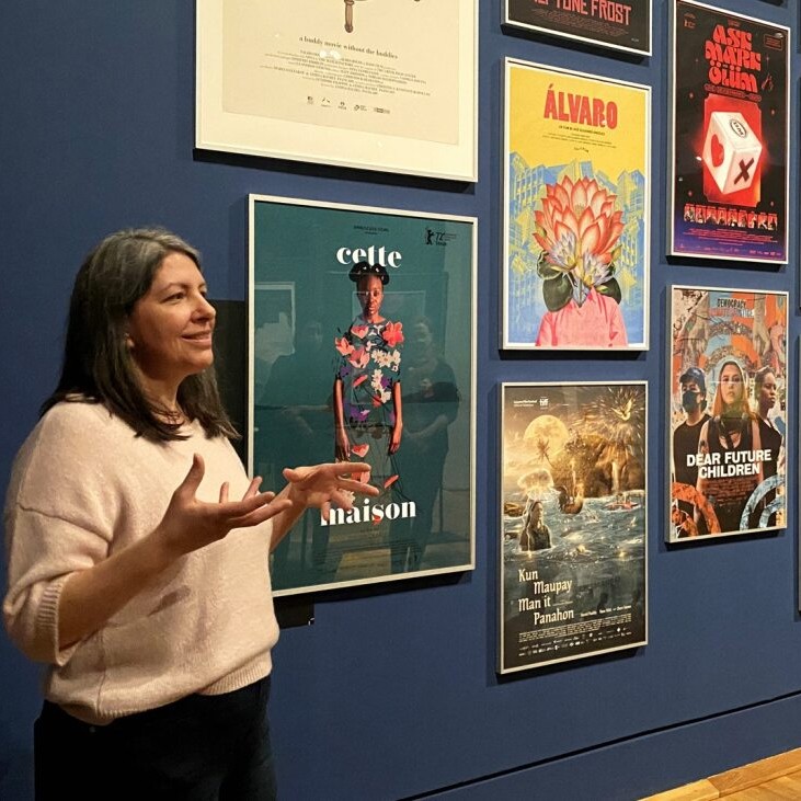
To accompany the exhibition Full splash! – Le jaune s’affiche, I invited several artists to share their reflections on the colour yellow. The graphic designer and poster artist Karine Savard was so generous in her responses that it seemed fitting to turn them into a blog post. Her work, which has drawn increasing attention in recent years, was notably presented at the Berlinale in 2024. Even though we are showing only one of her posters as part of Full splash! – Le jaune s’affiche, I felt it was important to highlight the scope of her practice, which extends well beyond the exhibition.
What is your personal relationship with the color yellow?
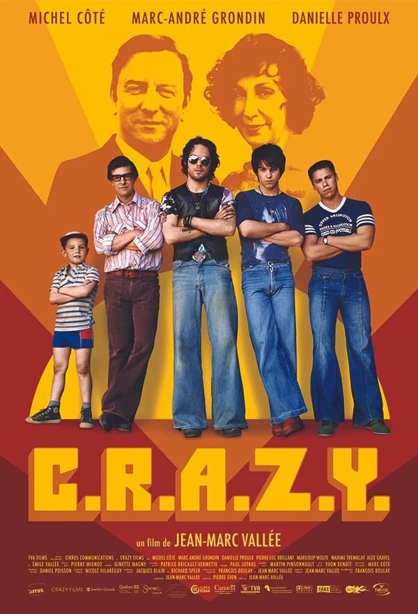
I often use the color yellow in my posters because it is bright, light, warm, and stands out easily. I’ve used it many times, notably for the title and background of the poster for the film C.R.A.Z.Y., or again as the dominant background colour for the films Ensemble, My Salinger Year, Reinas, and others.
For the poster of C.R.A.Z.Y., yellow seemed appropriate to symbolize the protagonist’s journey of self-affirmation. It’s also the colour I used partly for the background at the top of the poster, where the images of the parents are placed: it allows actors Michel Côté and Danielle Proulx to stand out. It was important for the distributors to foreground the lead actors. I therefore found a way to integrate them so they appear to shine above their descendants, marking the bond between generations.
What do you think about its use in poster design?
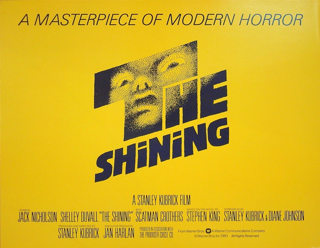
The shades of yellow, orange, and red are colours that stand out strongly and therefore work well for posters, because they catch the eye from a distance in public space. I’m thinking, for example, of a poster I own of Stanley Kubrick’s The Shining, designed by Saul Bass. Through the first letter of the title, which occupies the centre of the frame, we see a frightening black-drawn face. Because the visual is so minimal, the yellow adds another layer of meaning by signalling the character’s madness. At the same time, this light colour makes the drawing and the title pop.
Could you tell us about the design of the poster for the film Sashinka, which is presented in the exhibition?
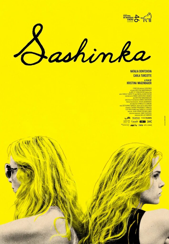
Sashinka, by filmmaker Kristina Wagenbauer, focuses on the conflicted relationship between a young woman and her eccentric mother, who suddenly reappears in her life. The colour yellow helped me bring forward the blonde colour of both their hair.
At the same time, I wanted to move away from the “blonde bombshell” stereotype so often repeated in cinema. Feminist writer Martine Delvaux calls these recurring female clichés “girls in series”, reminding us that although they symbolize patriarchal ideals, they also carry the potential for resistance simply through their sheer number. Within every woman lies a series, a family, an army. Delvaux imagines female lineage as a place from which to reinvent the feminine collectively.
For the Sashinka poster, I used a graphic treatment inspired by screen printing. This aesthetic can evoke the images of American pop artist Andy Warhol, for example his Marilyn Monroe works, where the hyper-sexualized blonde bombshell is shown as a trademark, a mass-produced commodity, a serialized girl…
By desaturating the image and treating it in high contrast, I highlighted the silhouettes of the two women. They stand back-to-back, yet their hair connects them at the bottom of the poster. The bright yellow background that fills the frame evokes not only the colour of their blonde hair, but more importantly underscores the centrality of their relationship. In the film, it is through gradually accepting her mother — who herself suffers from a lack of love — that the young woman learns to accept herself.
Karine Savard has been an artist and graphic designer for over twenty years. She has created a substantial body of posters for both Québécois and international films, including C.R.A.Z.Y., Incendies, Viking, Blue Is the Warmest Colour, and more recently, Festin boréal, Comme le feu, Bedrock, and others.
Header image: Karine Savard giving a presentation during a visit to the exhibition The Big Screen. Film posters of all times, Kunstbibliothek, Staaliche Museum, Berlin (2024). Photo: Catarina Sampaio.
Marie-Douce St-Jacques is Head of exhibitions and Performance Curator at the Cinémathèque québécoise.